ShopDreamUp AI ArtDreamUp
Deviation Actions


Suggested Deviants


Suggested Collections


![Vi [Viriathus] Dreamkeepers fan art](https://images-wixmp-ed30a86b8c4ca887773594c2.wixmp.com/f/b52974cd-4912-4e27-ad26-0a26ab6a332b/da2gla1-41ae0d91-8a2c-40d9-abdb-ad28d667542c.jpg/v1/crop/w_184,h_184,x_0,y_31,scl_0.047034764826176,q_70,strp/vi__viriathus__dreamkeepers_fan_art_by_bernarddk_da2gla1-92s-2x.jpg?token=eyJ0eXAiOiJKV1QiLCJhbGciOiJIUzI1NiJ9.eyJzdWIiOiJ1cm46YXBwOjdlMGQxODg5ODIyNjQzNzNhNWYwZDQxNWVhMGQyNmUwIiwiaXNzIjoidXJuOmFwcDo3ZTBkMTg4OTgyMjY0MzczYTVmMGQ0MTVlYTBkMjZlMCIsIm9iaiI6W1t7ImhlaWdodCI6Ijw9MTcxOCIsInBhdGgiOiJcL2ZcL2I1Mjk3NGNkLTQ5MTItNGUyNy1hZDI2LTBhMjZhYjZhMzMyYlwvZGEyZ2xhMS00MWFlMGQ5MS04YTJjLTQwZDktYWJkYi1hZDI4ZDY2NzU0MmMuanBnIiwid2lkdGgiOiI8PTEwMjQifV1dLCJhdWQiOlsidXJuOnNlcnZpY2U6aW1hZ2Uub3BlcmF0aW9ucyJdfQ.V5vEXDzRQ9Ykbu-LJe0b_EzVPU1nNWd3WAi4kgbuc80)
![Vi [Viriathus] Dreamkeepers fan art](https://images-wixmp-ed30a86b8c4ca887773594c2.wixmp.com/f/b52974cd-4912-4e27-ad26-0a26ab6a332b/da2gla1-41ae0d91-8a2c-40d9-abdb-ad28d667542c.jpg/v1/crop/w_92,h_92,x_0,y_16,scl_0.023517382413088,q_70,strp/vi__viriathus__dreamkeepers_fan_art_by_bernarddk_da2gla1-92s.jpg?token=eyJ0eXAiOiJKV1QiLCJhbGciOiJIUzI1NiJ9.eyJzdWIiOiJ1cm46YXBwOjdlMGQxODg5ODIyNjQzNzNhNWYwZDQxNWVhMGQyNmUwIiwiaXNzIjoidXJuOmFwcDo3ZTBkMTg4OTgyMjY0MzczYTVmMGQ0MTVlYTBkMjZlMCIsIm9iaiI6W1t7ImhlaWdodCI6Ijw9MTcxOCIsInBhdGgiOiJcL2ZcL2I1Mjk3NGNkLTQ5MTItNGUyNy1hZDI2LTBhMjZhYjZhMzMyYlwvZGEyZ2xhMS00MWFlMGQ5MS04YTJjLTQwZDktYWJkYi1hZDI4ZDY2NzU0MmMuanBnIiwid2lkdGgiOiI8PTEwMjQifV1dLCJhdWQiOlsidXJuOnNlcnZpY2U6aW1hZ2Uub3BlcmF0aW9ucyJdfQ.V5vEXDzRQ9Ykbu-LJe0b_EzVPU1nNWd3WAi4kgbuc80)
You Might Like…


Featured in Groups

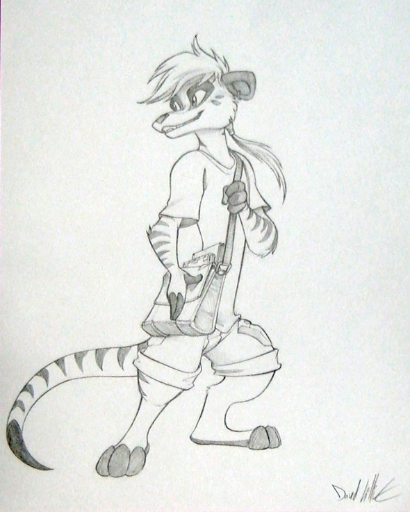
Description
Commission from MFF 2013.
Image size
590x737px 382.25 KB
Make
SAMSUNG ELECTRONICS
Model
HMX100
Shutter Speed
1/60 second
Aperture
F/2.0
Focal Length
3 mm
ISO Speed
100
Date Taken
Nov 23, 2012, 4:22:43 PM
© 2014 - 2024 Dreamkeepers
Comments8
Join the community to add your comment. Already a deviant? Log In
This is a good piece for a sketch. The lines are clean, the anatomy is consistent, and the values show decent contrast. The expression is very nice. Also I like thylacines.
I believe this piece as a whole could have been improved with a more defined line of motion, to which the rest of the figure could relate. The composition of the figure is currently divided into several non-central areas: the line of the head and gaze dead-ends, leading back neither through the ponytail or neck; the circle formed by the tail and right leg is isolated by the block of the satchel; the right and left leg together, which should form a shape but does not, due to the downward direction of the right foot; and the flattened oval of the arms, right shoulder and satchel, which lacks any strong tangents leading into another area.
If there had been a stronger line of motion from the right foot through the head, which seems to have been your original intention, the figure would have had a more dramatic stance. This would have involved only minor changes: shifting the right foot to point more to the left to bring the right leg more in line with the spine, pointing the base of the tail downward for the same reason and the tip upward so it leads back to the figure's head, moving the satchel slightly to the left so it doesn't block the central line of the body, and moving the head slightly to the left so that the neck is a more dramatic angle. Moving the left hand down toward the hips and blowing the ponytail into the body (maybe over the shoulder and toward the viewer) would prevent their lines from leading off the page as they do now.
It's possible you could also have adjusted the composition with some kind of circular background element, to give all the lines that lead off it a more unified appearance. A circle that went from somewhere just over or behind its head to the base of its tail would isolate the upper part of the figure, and give its offscreen look the appearance of greater depth, and taken some of the weight off the bottom of the figure. It would have also caught the lines from the left arm and pony tail and led back through the hips.
This is a good piece, which a minor application of the motion you do so well in your comic could have substantially improved.